Which color season am I?...
And does it matter anyways? Well it does matter, more than people think. Have you ever tried on a shirt and instantly felt more radiant like your eyes sparkled and your skin looked fresher? Or, on the flip side, worn a color that made you look tired or washed out? That’s the power of color harmony. Color analysis is the art and science of identifying which hues naturally enhance your features based on your skin tone, eye color, and hair shade.
At the heart of this method lies seasonal color theory, which groups people into four main color “seasons”: Spring, Summer, Autumn, and Winter. All of these seasons are then divided to 3 sub-seasons called dark, true and bright.
In the sections ahead, we’ll dive into color theory and how it works, what defines each season, and how you can find the palette that aligns with your personal coloring. Ready to see which season you belong to?
Cool or warm
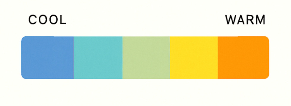
One of the most essential concepts in color analysis is the difference between cool and warm tones.
Cool tones are colors with a blue, pink, or purple undertone.
Think icy blues, crisp greys, emerald green, and fuchsia.
These colors tend to feel calm, refreshing, or sophisticated. People with cool-toned features often look best in silver jewelry, white or blue-based reds, and soft pastels with a bluish base.
Warm tones, on the other hand, have a yellow, orange, or red undertone.
Picture golden yellows, olive greens, coral, and warm browns.
These shades often feel cozy, energetic, or earthy. Individuals with warm-toned features usually glow in gold jewelry, cream or ivory fabrics, and reds with an orange base.
How This Affects Your Color Season
In seasonal color analysis, the tone of your coloring (cool or warm) is one of the first criteria used to determine your seasonal color palette:
Winter and Summer types fall on the cool side of the spectrum.
Spring and Autumn types belong to the warm side.
Muted or Bright
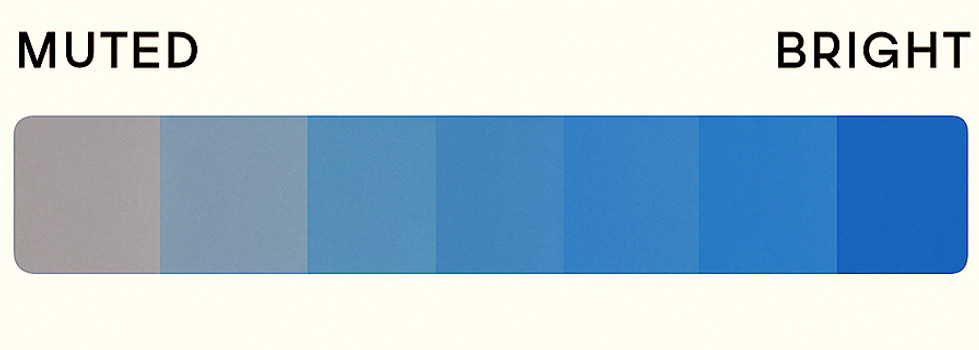
When it comes to color analysis, it’s not just about which colors you wear, it’s also about how those colors appear. One of the most important aspects to understand is color intensity: whether a color is bright and vibrant, or muted and soft.
Bright colors are clean, crisp, and high in contrast. These are colors that pop.
Think true red, Bright green or cobalt blue They reflect a lot of light and bring energy and clarity. People whose natural coloring includes strong contrast (like dark hair and light eyes or porcelain skin and deep hair) often shine in bright tones.
Muted colors, by contrast, have been toned down with a hint of grey.
These are more subtle and understated,
like dusty rose, sage green, or slate blue. Muted colors tend to blend more harmoniously and feel calming. They suit people with delicate or low-contrast features, such as soft brown hair, light eyes, and beige or peach-toned skin.
Why It Matters in Color Analysis
Your natural coloring has its own level of intensity, and the most flattering shades will match that. Wearing colors with the right intensity helps your features stand out in the best way—your eyes seem brighter, your skin more even, and your overall look more cohesive.
In seasonal color theory:
Springs and Winters typically wear brighter colors well.
Summers and Autumns often look best in muted shades.
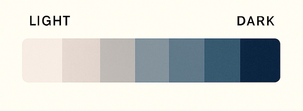
Light or dark
In color analysis, value refers to how light or dark a color is. This quality—separate from temperature or intensity, is crucial in finding colors that harmonize with your natural features. Wearing the right level of lightness or darkness can make your skin look more even, your eyes more vivid, and your overall appearance more polished and cohesive.
Light colors are tints, colors mixed with white.
Think of soft blush pinks, sky blues, icy lavenders, or pale mints.
These shades feel airy and delicate. People with naturally light features, such as fair skin, blonde or light brown hair, and light eyes—are often flattered by lighter tones that mirror their soft coloring.
Dark colors are shades, colors mixed with black or deeper pigment.
Think deep navy, burgundy, forest green, or charcoal.
These hues are rich, dramatic, and grounding. Individuals with strong coloring, like deep skin tones, dark eyes, or very dark hair—can carry darker colors beautifully without being overwhelmed.